Trend related social post connections can be fun.

Word exercise game WORDLE scores keep getting posted on social and our client Havertown Movers wanted to get in on the excitement. The one thing that connected with me about this and really any social post that is trend related is the common social media user who is active on instagram, twitter, TikTok most likely will also be using a trend related mobile game like WORDLE. To cross the two you get an intersection of brand recognition on both ends.

Our client is a moving company and the words in this custom WORDLE game make sense and are relevant to their services. I had the delight of working on this with my social media mentor Jackie Marshall. Thanks Jack.

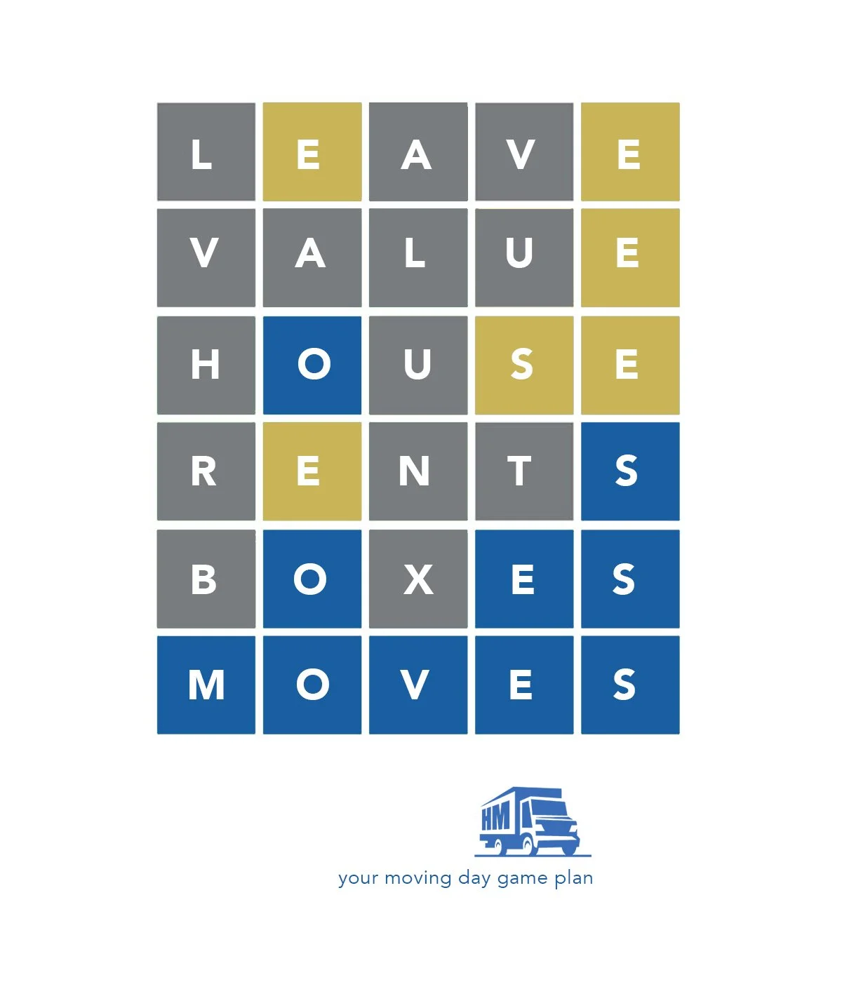
Sharing the results of our WORDLE.

From Milton Glaser With Love

Billboards, posters, and movie trailers inspire the dreams of young creators and start an inner dialogue of ways to solve creative problems. I have a champion that I greatly admire; he has created branding and design that has “informed and delighted” for more than half a century. Milton Glaser’s body of work in illustration, advertising, and design has inspired countless creatives and many, many clients who want that ‘Glaser touch.’ His cult like status, conceptual thinking, and ability to create rich visuals that are as inventive as they are euphoric makes me proud that I had the recent opportunity to continue a visual story that he had created decades ago.

NJOY1_lo.jpg


Before he created the “I (heart) NEW YORK” logo in the 70’s, Mr. Glaser took a foodservice coffee creamer brand named N’JOY and made it “N (heart) JOY” for The Sugar Foods Corporation who has an expansive portfolio of foodservice and consumer brands. Their N’JOY offering includes dry condiments, sweeteners, creamers, and sugar.


The N’JOY canisters usually reside in office settings or courtesy refreshment areas such as car washes and auto dealer service spaces. It has been a part of many T.V. Police dramas. Next CSI, check out the scene where Gary Sinise has dialogue around a coffee center. The blue and red canisters are usually in frame. 


The previous N’JOY package after Mr. Glasers’ had performed very well for about a decade, but rumblings from distributors and warehouse clubs suggested that it was time for a refresh. The club store shelves just like traditional grocery shelves have become a shouting match. N’Joy wanted to stand out and get noticed but at the same time communicate the very simple offer of refreshment.

NJOY2_lo.jpg


The solution we came up with was a bold swoop of color combined with an amplified type treatment. Our visual asset of a simple coffee mug is strategically placed with the text that creates and quick read hierarchy, simple to get in a flash. Although modified, the “N (heart) JOY” logo remains at the top along with one row of the original “sharks teeth” graphic. The end result was very positive feedback about the updated assets and has allowed the design to be accountable for a quantifiable sales lift. I hope Milton likes it.